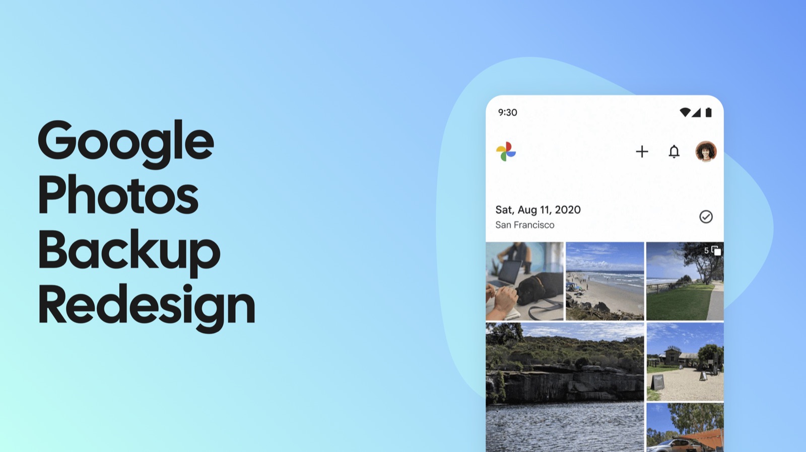
A background system with no visible failure mode
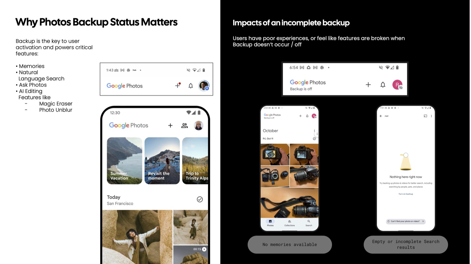
Backup is the quiet infrastructure underneath almost every feature people associate with Google Photos: Memories, natural-language search, Ask Photos, and AI editing tools like Magic Eraser and Photo Unblur all depend on your library actually being backed up. None of that is obvious from the app itself.
When backup is off or incomplete, Photos doesn't tell you that. It just quietly under-delivers: Memories has "nothing here right now," search returns empty results, editing tools feel broken. Users experience the symptoms of a system failure with no way to connect them back to the cause — backup status was, for practical purposes, invisible.
Leading the redesign end to end
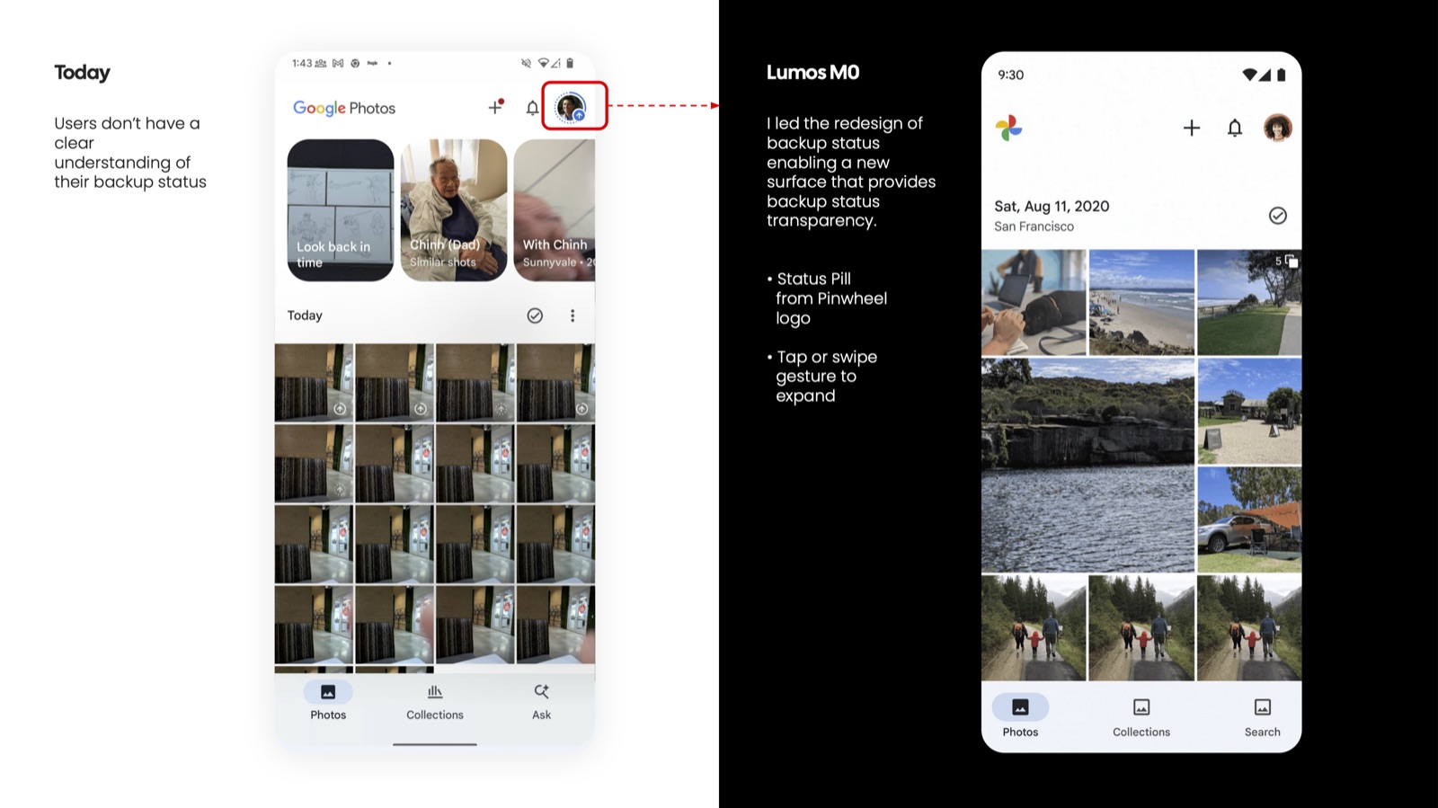
I led the redesign of backup status, from framing the problem through shipping a new surface that gives users real transparency into what's backed up, what isn't, and why it matters. That included navigating an open strategic question with the broader team: was this a one-off growth experiment, or a permanent part of the product?
Turning the product's own logo into the status indicator
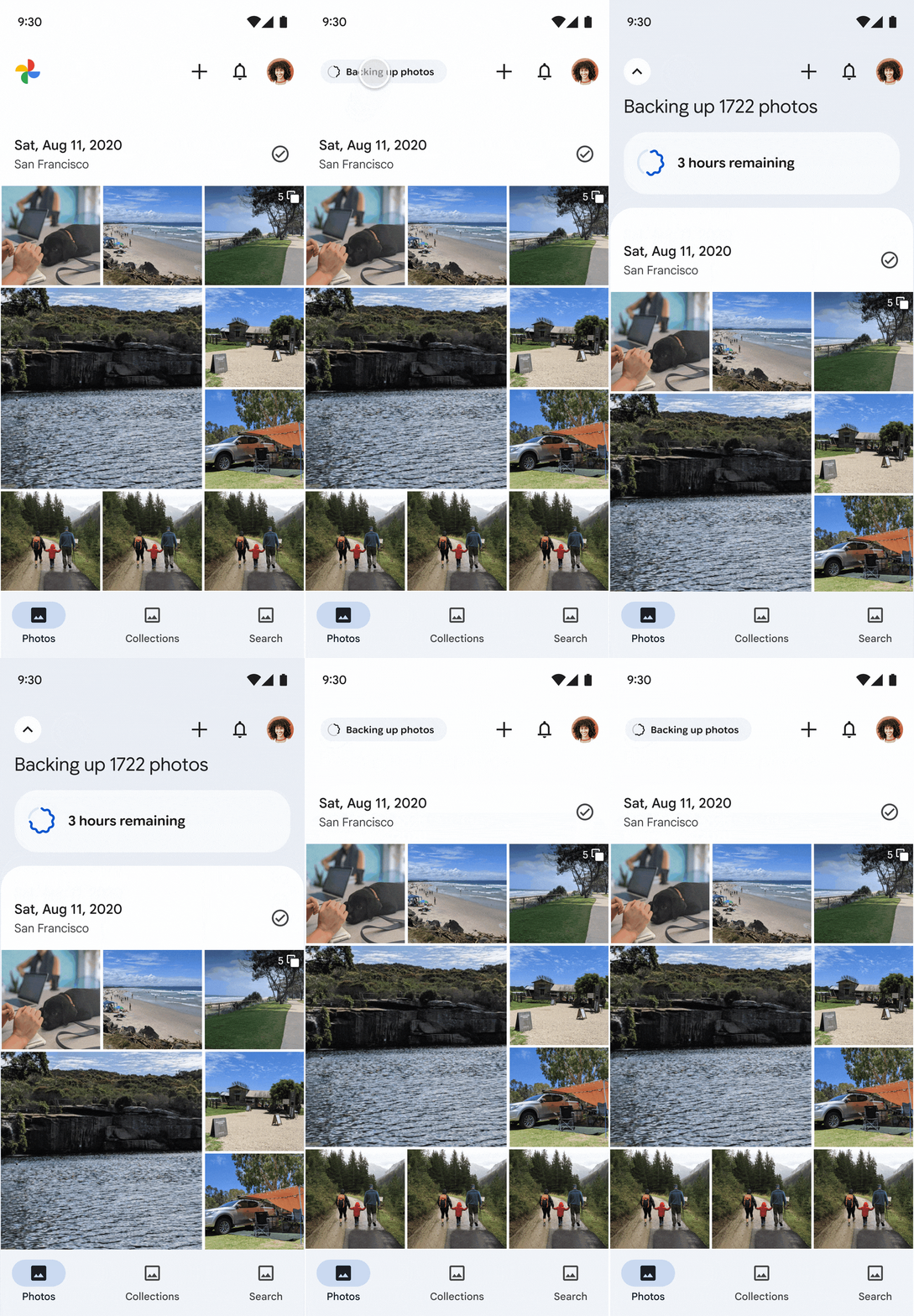
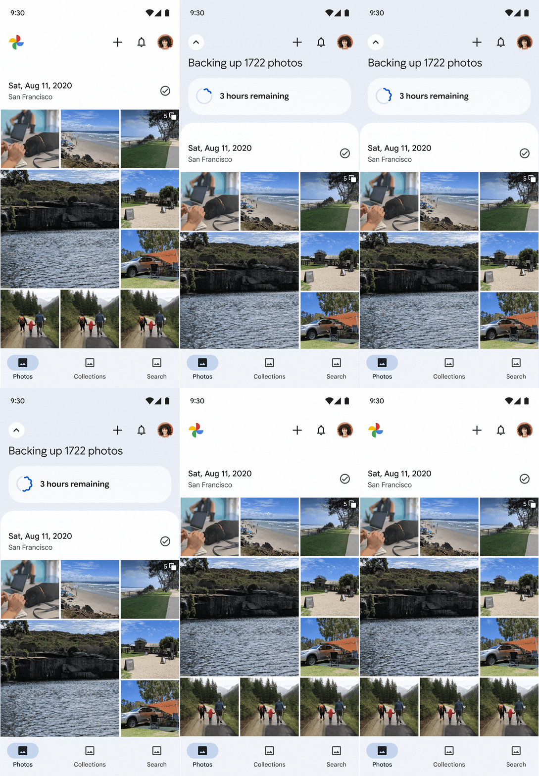
Rather than adding new chrome to an already-dense app, I built the status system — internally called Lumos — around the Google Photos pinwheel mark itself. The pinwheel becomes a status pill with a defined state machine: Preparing backup → Backing up, with determinate progress ("Backing up 1,722 photos — 5 hr 46 min remaining") → Paused (for example, waiting for Wi-Fi) → Complete.
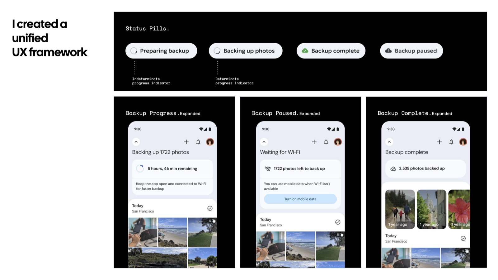
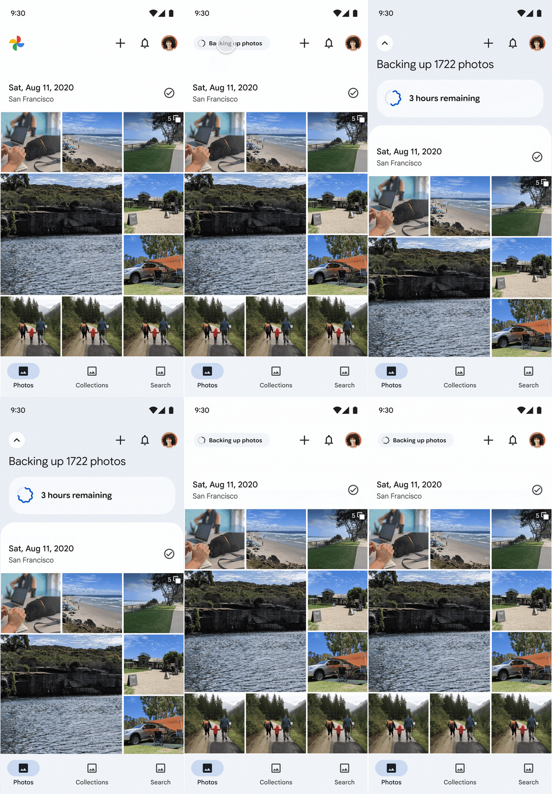
I also designed two interaction models for the same component — tap-to-expand and auto-expand — with a more pronounced icon rotation on auto-expand so the motion itself signals activity.
The choices that changed the experience
- Reuse the brand mark instead of adding UI. The pinwheel already exists on every screen — turning it into the status affordance meant zero new chrome for a very dense app.
- Design the interruption states, not just the happy path. Paused, waiting-for-Wi-Fi, and backup-off all got their own explicit treatment instead of falling back to a generic error.
- Resolve the "nudge vs. end-state" debate with artifacts, not opinions. When teams disagreed about whether an off-state prompt should be a temporary growth experiment or the permanent design, I built concrete, testable concepts of both to make the tradeoff concrete.
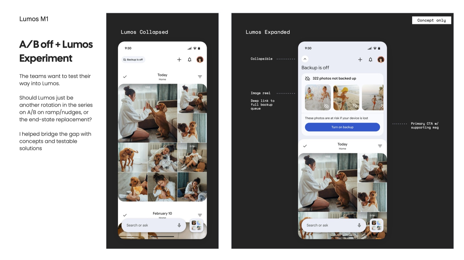
One component, three product surfaces
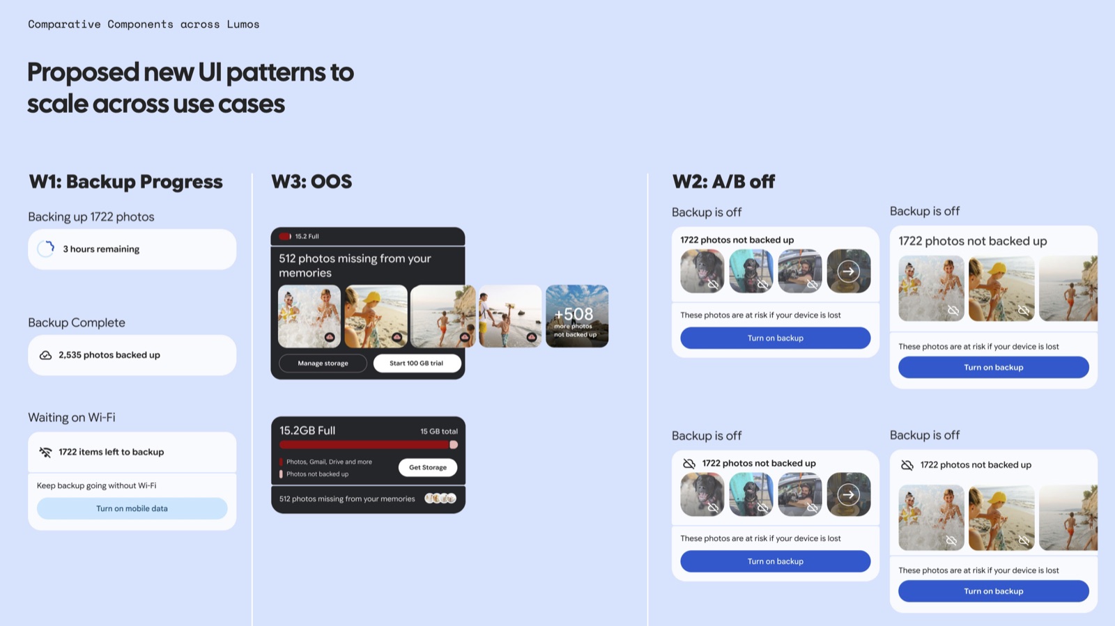
The Status Pill wasn't designed for backup-in-progress alone. I proposed it as a pattern that scales across three related but distinct scenarios: backup progress, an A/B-tested off-state prompt, and an out-of-storage state tied directly into the storage upsell flow. Same component family, three different jobs.
Motion as meaning
Every state of the pill got its own progress-indicator treatment — determinate rings for backup-in-progress, static icons for paused and complete — so a glance tells you not just that something is happening, but what kind of thing. The icon-rotation detail on auto-expand is a small motion decision that does real communication work: it's the difference between a static icon and one that reads as alive.
Motion & interaction details
Tap to expand + auto-expand

Product outcomes and a framework others could build on
The redesign shipped publicly in Google Photos on Android, rolling out with version 7.39, and was independently covered by 9to5Google (August 2025).
- Subscription growth and retention. The redesign contributed to increased monthly subscriptions and reduced churn. Exact figures are confidential.
- More users opted into backup. By showing which photos weren't backed up and explaining how backup supports key features, the experience helped users with backup turned off make an informed choice to turn it on. This education contributed to increased backup opt-in. Exact results are confidential.
- A shift in engineering priorities. The work helped engineers recognize the value of a scalable UX framework and giving users a choice in how they engage with the app. That approach contributed to improved product KPIs.
- Adoption beyond my own work. Other designers built on the framework, extending its value beyond the initial redesign. My design director recognized the quality of the design and its organizational impact.
A reusable way to make the invisible visible
Photos now has a single, extensible pattern for surfacing background-system health at the moment it actually matters to someone — not buried in settings. The next invisible system that needs a face, whether that's sync errors or a future storage state, has a proven component and state model to start from instead of a blank page.
Other designers could build on an established framework rather than define each experience from scratch. For engineering, the work established a shared reference for making system status understandable while preserving users' choice in how they engage.