The Problem
A generic checklist instead of specific advice
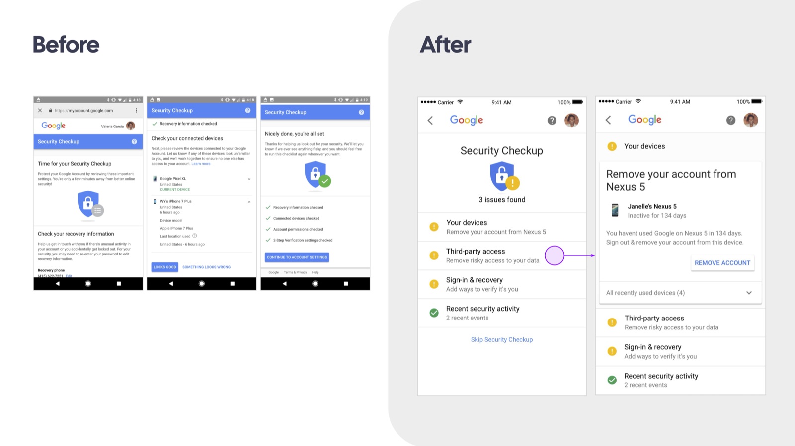
Security Checkup treated every account the same way — a routine list of things to verify, regardless of whether anything was actually wrong. It didn't triage, prioritize, or tell you what mattered most for your account right now.
My Role
Lead UX Designer for the 2017 redesign
I led the redesign of Google's Security Checkup to make it far more opinionated: personalized, actionable security advice about your specific account, sorted by what actually needed attention.
Key Decisions
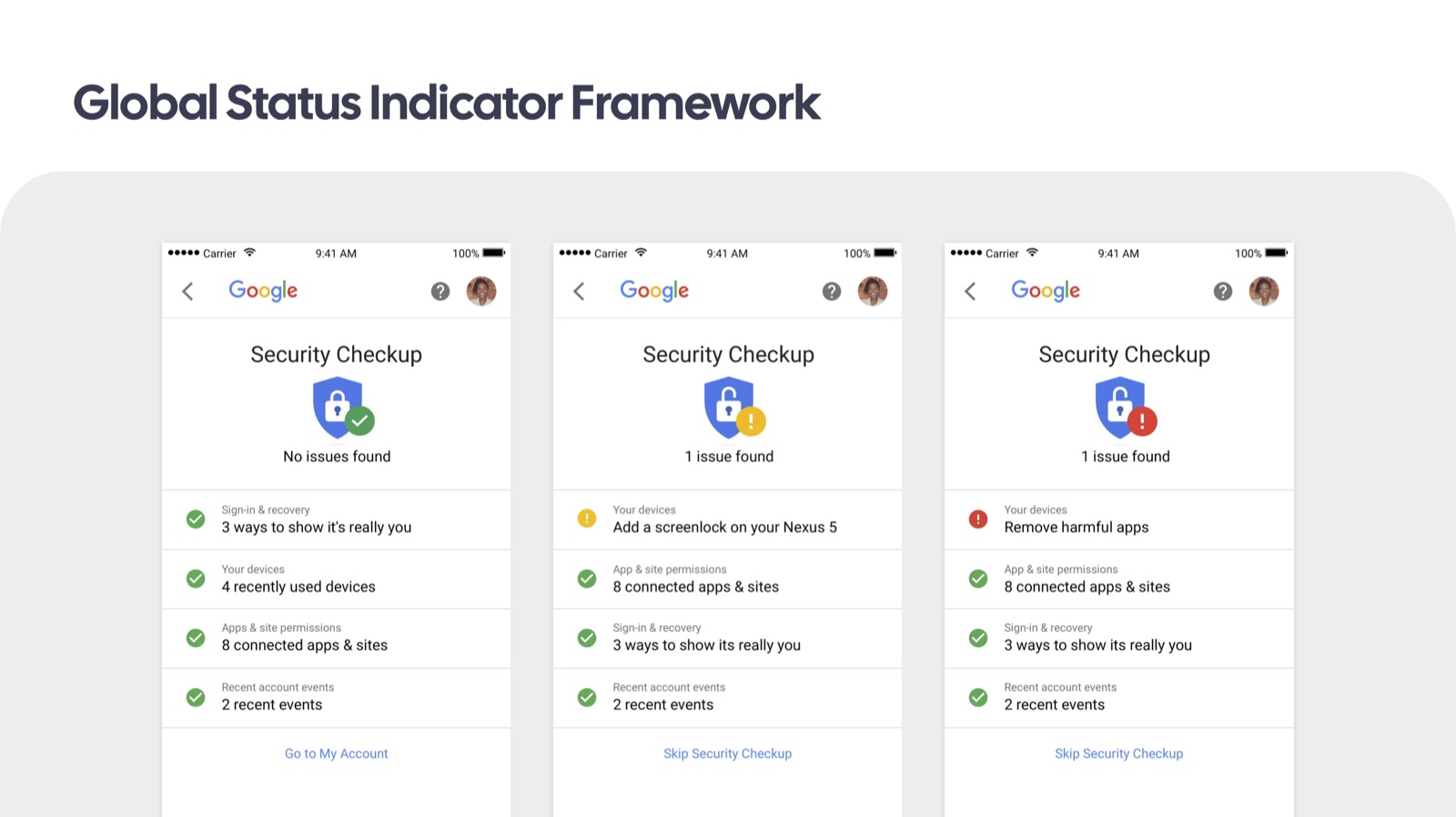
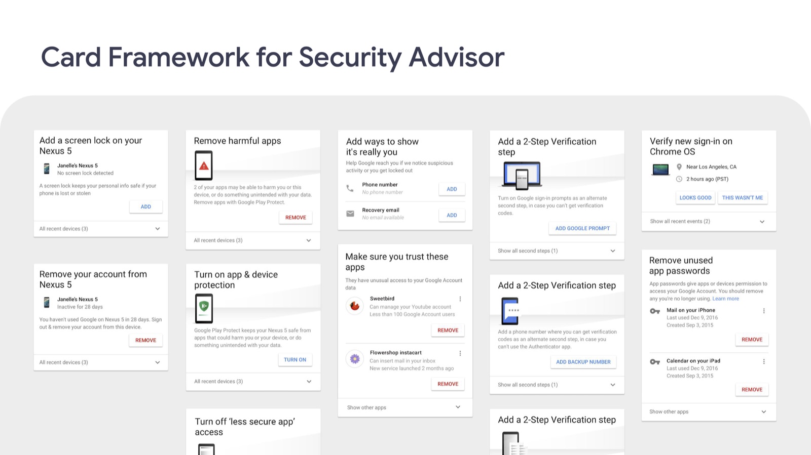
One card framework, one global status
- A single card framework that generates ten-plus distinct advice types — screen lock, harmful apps, 2-step verification, unused app passwords — from one consistent template.
- A global status indicator: one three-state shield (no issues / low severity / high severity) that tells you at a glance whether to worry, reused everywhere the checkup appears.
- Severity-sorted issues that lead straight to the fix, replacing a flat checklist with a prioritized, opinionated list.
- A designed loading moment, not a generic spinner. Loading states are often forgotten or dismissed in security UX — I treated the transition into Security Checkup as part of the product, not a gap between screens.
Designing Complex Information
Third-party access and scopes that scare people
- Progressive disclosure for high-stakes permissions. Third-party app access requests are some of the most consequential — and least understood — decisions in the flow. Scope details stay collapsed by default, with the full list one tap away for anyone who wants to inspect exactly what they're granting.
- A risk-tiered information system, not one screen for every app. The App Detail view changes its own density based on the app: a low-risk, popular app shows minimal extra detail, while a higher-risk one surfaces an explicit warning alongside the specific scopes that triggered it — the interface gets more careful exactly when the decision does.
- The remove-access flow ends in confirmation, not silence. Revoking a risky app's access closes with an explicit success moment rather than a quiet return to the list — a deliberate beat that confirms the fix actually worked.
Impact
Clearer advice and actionable account security
The redesign supported issue resolution and recovery-information adoption by translating account risks into understandable advice and clear actions. A reusable card framework connected individual recommendations into a consistent security experience.